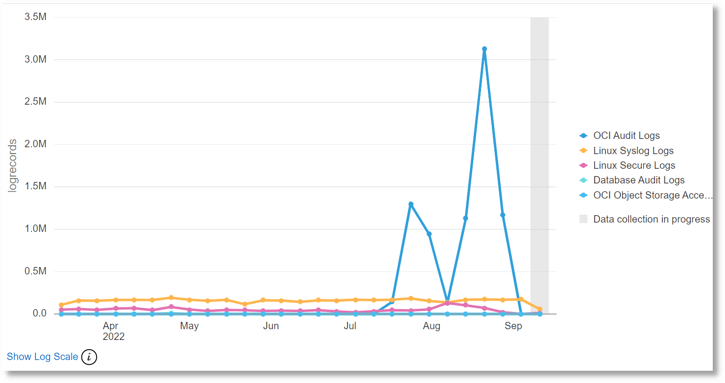
Line Charts Visualization
Oracle Log Analytics provides a
line chart visualization that lets you group by a numeric field, then graph the trend of
values over time. Only numeric fields or aggregate output (sum as sum, average if the
fields or output can be broken up by time) can be selected for the y-axis.
For example, to view the count of all Apache log entries, which are grouped by
source, over a period in time (say the last 7 days):
The count of Apache log records grouped by Log Source is displayed in the chart.
