Issues Visualization
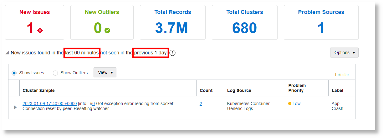
Issues visualization helps you to identify new issues in your logs in the selected time range. These are the issues found in the selected time range but are not present in the baseline time range, typically last 12 hours, specified for the analysis.
Issues visualization analyzes the logs in the following order:
-
It creates clusters of log records by grouping similar log records. To know more about clustering, see Clusters Visualization.
-
The clusters that are common in both the time ranges are removed.
Next, it applies the cluster compare utility to draw the comparison between the unique clusters in the two time ranges. For more information on how cluster compare works, see Use Cluster Compare Utility and clustercompare.
-
In the remaining log records, only those that have keywords related to issues like error or exception, or labels related to issues are displayed. You can customize your sources to add new labels and problem priority indication to your logs using the label definitions in the source. See Use Labels in Sources.
Baseline time: This is the time range that best groups the typical set of logs that your system would generate. Select the time range that captures the entire cycle of log generation, for example, 8 hours, 12 hours, 1 day, or 5 days. Longer baseline range may result in longer time to run the query.
Time range for analysis: This is the time range that has the logs of your interest for analysis. Use the time selector to identify this range.
How is the comparison scope identified: Based on your selection of the baseline time and the time range of the logs for analysis, first the time range for analysis is fixed. Next, the baseline range is located to precede the time range of analysis.
For example, If you select the analysis time range as Last 60
minutes, and the baseline range as 12 hours, then:
|=================================|========================|
      Baseline Time Range         |   Analysis Time Range
 12 hours before Last 60 minutes  |    Last 60 minutes
Example:  8AM - 8PM Today         |    8PM - 9PM Today