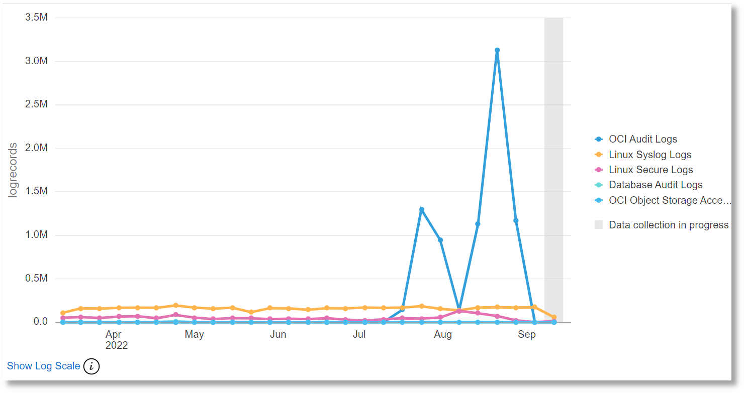
Line Charts Visualization
Oracle Logging Analytics provides a
line chart visualization that lets you group by a numeric field, then graph the trend of
values over time. Only numeric fields or aggregate output (sum as sum, average if the
fields or output can be broken up by time) can be selected for the y-axis.
For example, to view the count of all Apache log entries, which are grouped by
source, over a period in time (say the last 7 days):
The count of Apache log entries grouped by Log Source is
displayed.
Similarly, to view a graph displaying the average content size of the Apache
log records over time, grouped by log source, from the Other
section of the Fields panel, drag and drop the Content
Size field to the Y-axis section in the
Visualize panel. Ensure that you’ve selected the
Average function from the Y-axis
list.
You can select different statistical operations that you can perform on the selected field.
Note
Some fields may not support all operations. For example, numeric
operations, such as Average, Min, Max, Median, and so on won’t work on fields
that are of data type String.
