Analyze Chart
You can create an Analyze chart by navigating to the Analyze menu, and
clicking Create Chart. Alternatively, run the classify command to
generate the analyze chart.
Topics:
- Information Displayed in Analyze Chart
- Change the Title of the Analyze Chart
- Control the Colors in the Analyze Chart
| Analyze Chart Option | Utility |
|---|---|
|
Chart Type |
Select from the bubble, scatter, tree map, and sunburst type of charts to view the groups. By default, a bubble chart is displayed.
|
|
Height |
Increase or decrease the height of the chart to suit your screen size. |
|
Swap X Y axis |
You can swap the values plotted along the x and y axes for better visualization. |
|
Show Anomalies |
View the anomalies among the groups displayed on the chart. |
|
Highlight Anomaly Baselines |
If you’ve selected to view the anomalies, then you can highlight the baselines for those anomalies. |
|
Show Group Count Legend |
Toggle the display of the Group Count legend. |
|
Zoom and Scroll |
Select Marquee zoom or Marquee select to dynamically view the data on the chart or to scroll and select multiple groups. |
Information Displayed in Analyze Chart
Analyze chart for Link visualization is useful in visually identifying anomalies in the patterns. B default, a bubble chart is generated. However, you can select a chart from the options available.
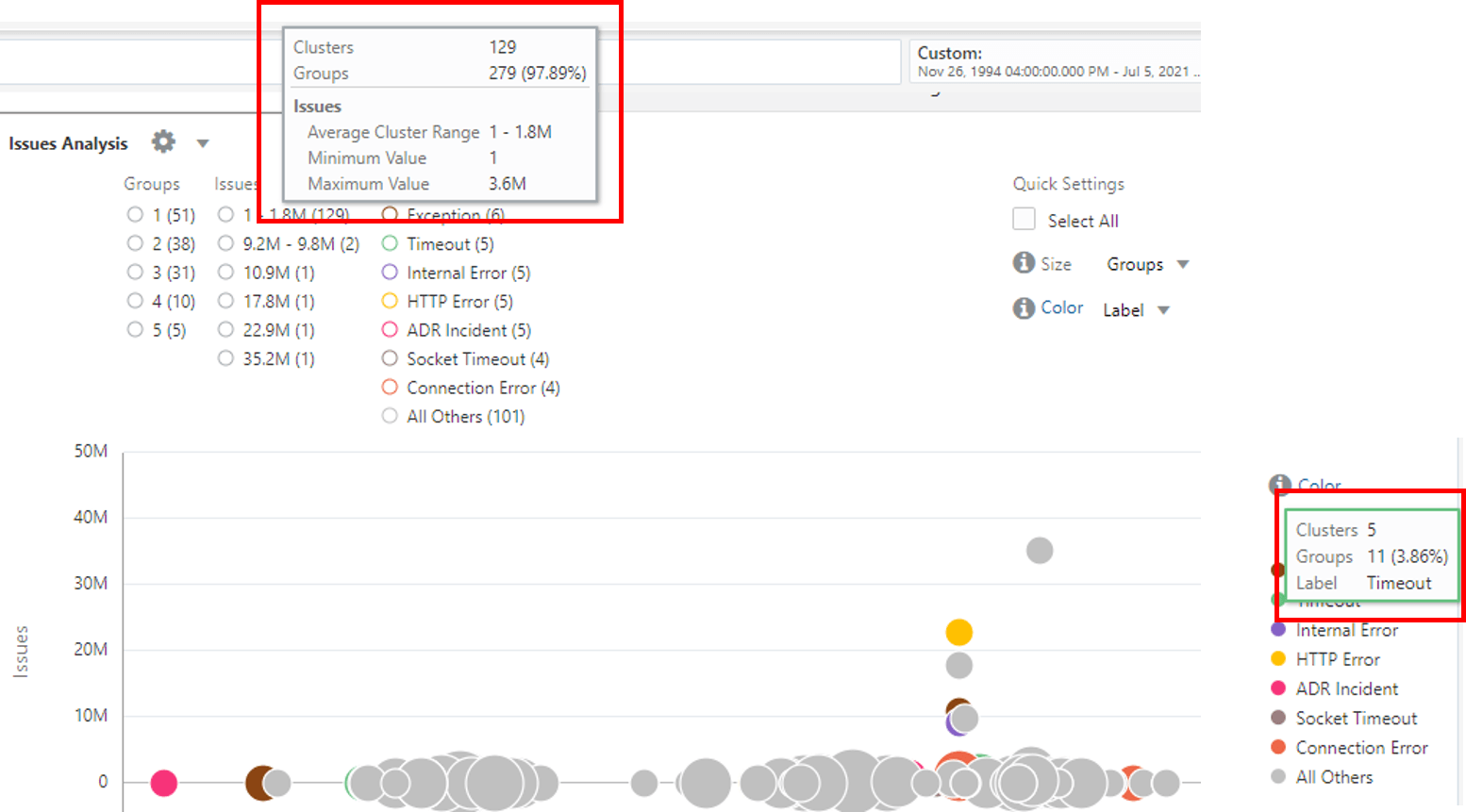
Each row in the Link table represents a unique group. The size of the bubble represents the number of such groups that are contained in the bubble. The position of the bubble is determined by the values of the fields that are plotted along the x and y axes. Hover the cursor over a filter legend to view the following information:
-
Clusters: Number of bubbles in the chart for this legend value
-
Groups: Total number and percentage of groups across all the clusters
-
Average Cluster Range: Each bubble (cluster) represents a range of values. An average is computed for each bubble which shows the minimum and maximum averages across all the bubbles for this value. This is applicable only for numeric values.
-
Minimum Value: Lowest absolute value across all the bubbles for this legend range.
-
Maximum Value: Largest absolute value across all the bubbles for this legend range.

Change the Title of the Analyze Chart
To improve the readability of the chart and for friendly analysis, you can change the title of the bubble chart by using the option in the Analyze dialog box.
To modify the title of the Analyze chart, click the ![]() Settings icon next to the title of the chart, and click Edit Chart. The
Analyze dialog box is displayed. Update the value of the field
Chart Title, and click Submit.
Settings icon next to the title of the chart, and click Edit Chart. The
Analyze dialog box is displayed. Update the value of the field
Chart Title, and click Submit.
As a result, the title of the chart is now changed to the value that you provided.
Control the Colors in the Analyze Chart
Two numeric fields are selected for plotting along the X and Y axes. The Time field can be used only for X-axis.
-
Any fields can be used to control the color of the bubbles. There are no restrictions about the types of the fields.
-
Numeric fields can be used for controlling the size of the bubbles. The value of the fields control the size of the bubble. The larger the values, the larger the bubbles.
For steps to select the fields for controlling the color of the bubbles in the chart, see Add More Fields for Analysis Using Size and Color.
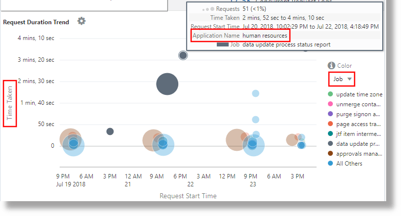
The following chart shows the Time Taken for Requests, which is plotted along Y-axis, and also the Application and Job that are involved in the analysis:

By default, the Link Analyze chart automatically selects a color palette
based on the values in the chart. To select a different palette or to add additional
field values, click the Color link. In the following example, the field
Event Type has Audit Analysis color palette
applied for different values:
'Log Source' = 'OCI Audit Logs'
| link Time, Event
| eval 'Event Type' =
       if(indexOf(Event,upload) != -1, Insert,
          indexOf(Event,update) != -1 or indexOf(Event,literal(patch)) != -1, Update,
          indexOf(Event,delete) != -1,Delete,
          indexOf(Event,get)    != -1 or indexOf(Event,list) != -1, Read, Other)
| classify 'Start Time','Event Type' as 'Audit Analysis'