Histogram Chart
Histogram shows the dispersion of log records over the time period and can be used to drill down into a specific set of log records.
More Topics:
You can generate charts for the log records, groups and numeric display fields. Select a row to view the range highlighted in the histogram.
The following chart options are to view the group data on the histogram:
| Histogram Chart Option | Utility |
|---|---|
|
Chart Type |
Select from the following types of visualization to view the group data:
|
|
Show Combined Chart |
This option combines all the individual charts into a single chart. |
-
You can modify the Height and Width of the charts to optimize the visualization and view multiple charts on one line.
-
When viewing multiple charts, you can deselect the Show Correlated Tooltips check box to show only one tooltip at a time.
-
When using the log scale, the Bar or Line With Marker type of chart is recommended.
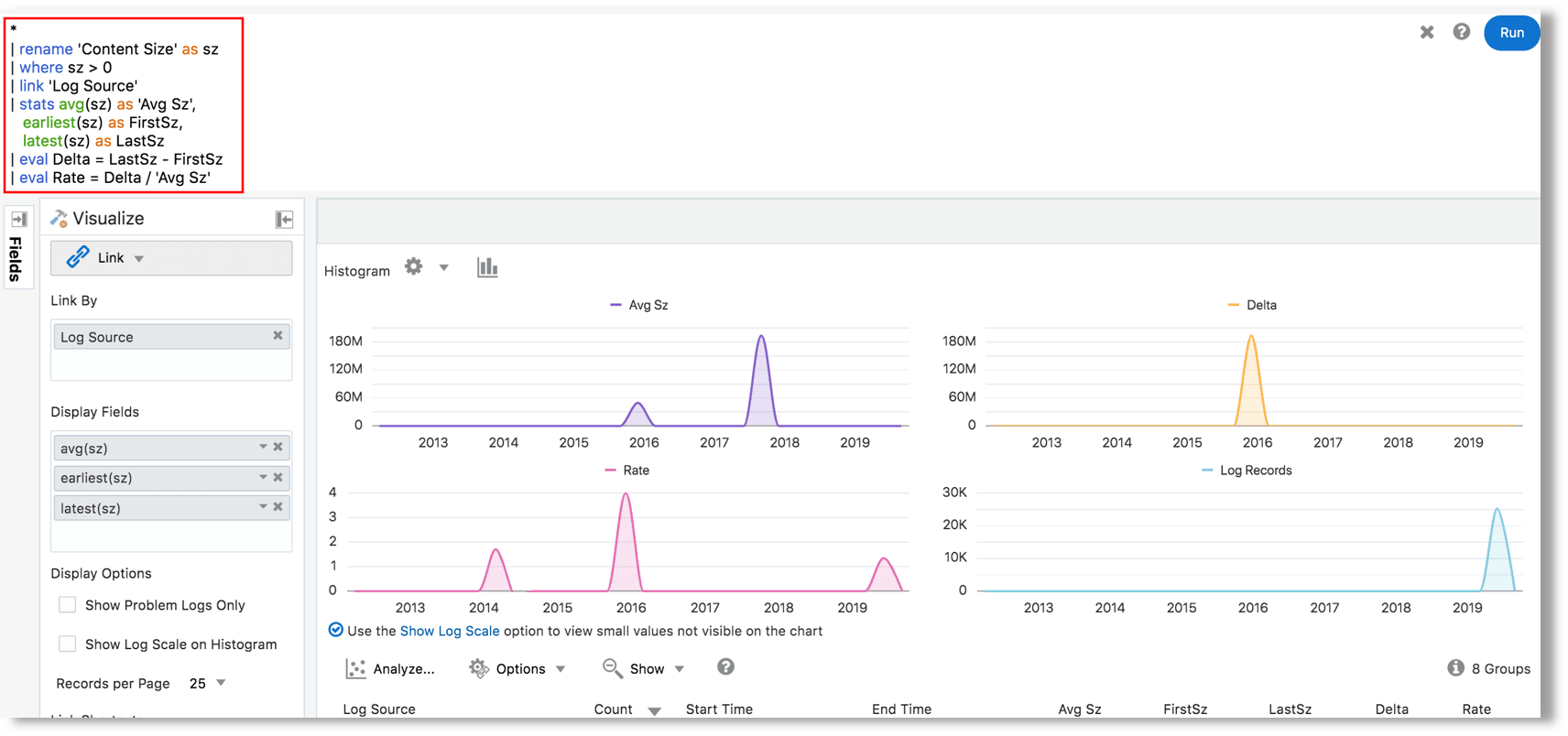
Example: For generating a chart for the numeric eval
command, let's consider the example query:
*
| rename 'Content Size' as sz
| where sz > 0
| link 'Log Source'
| stats avg(sz) as 'Avg Sz', earliest(sz) as FirstSz, latest(sz) as LastSz
| eval Delta = LastSz - FirstSz
| eval Rate = Delta / 'Avg Sz'
Here, the log source is the field considered for Group
By. The chart is generated for Delta,
Rate, and Avg Sz after the computations
performed as specified in the eval command. The resulting Line With Area
charts for the above fields are displayed as below:
Compare Link Metrics Across Time
Use the compare command to compare metrics generated in
link analysis to the previous time windows.
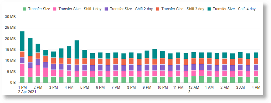
Following example query compares the data transfer between two IPs across previous four days by using the compare command:
'Log Source' = 'OCI VCN Flow Unified Schema Logs'
| eval 'Bytes Transferred' = unit('Content Size Out', byte)
| link Time, 'Source IP', 'Destination IP'
| stats sum('Bytes Transferred') as 'Transfer Size'
| compare fields = 'Transfer Size' timeshift = -1day count = 4
The resulting histogram chart that indicates the comparison:

Combine and Stack Histogram Charts
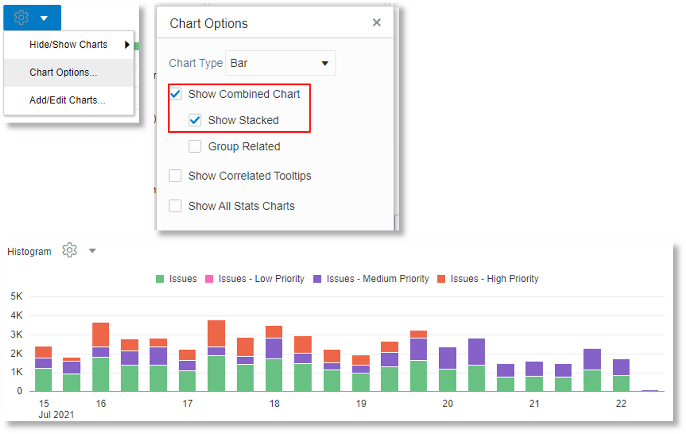
You can combine and stack charts using the Show Combined and Show Stacked options in link.
For example, the following query shows the trend of logs with various values for the Problem Priority field, in a stacked chart:
*
| link Time, Entity
| addfields
   [ 'Problem Priority' != null  | stats count as Issues ],
   [ 'Problem Priority' = Low    | stats count as 'Issues - Low Priority'    ],
   [ 'Problem Priority' = Medium | stats count as 'Issues - Medium Priority' ],
   [ 'Problem Priority' = High   | stats count as 'Issues - High Priority'   ]
| fields -Issues, -'Issues - Low Priority', -'Issues - Medium Priority', -'Issues - High Priority'
