Time Series Chart
You can generate the time series chart by running the
timestats or timecluster command.
Topics:
The following chart options are available to customize your view of the time series analysis:
| Histogram Chart Option | Utility |
|---|---|
|
Chart Type |
Select from the following types of visualization to view the group data:
|
| Group Charts |
None: Generates a separate chart for each time series function. All: Groups the charts for each time series function into one chart. |
|
Show Stacked |
This option shows the individual charts stacked to help compare the values, relative or absolute over time. |
|
Show Correlated Tooltips |
When viewing multiple charts, you can deselect the Show Correlated Tooltips check box to show only one tooltip at a time. |
|
Show Legend |
Toggle the display of the legends. |
|
Hide Y-Axis |
You can hide the display of the variable used to plot y-axis for better visualization. |
|
Height and Width |
You can modify the Height and Width of the chart to optimize the visualization and view multiple charts on one line. |
Change the Colors in the Time Series Chart
To change the Heat Map color scheme, from the ![]() Settings menu next to the title of your time series chart, and click Color
Palette. Alternatively, click Color link adjacent to the chart and the
field name. Select the colors in the color palette.
Settings menu next to the title of your time series chart, and click Color
Palette. Alternatively, click Color link adjacent to the chart and the
field name. Select the colors in the color palette.
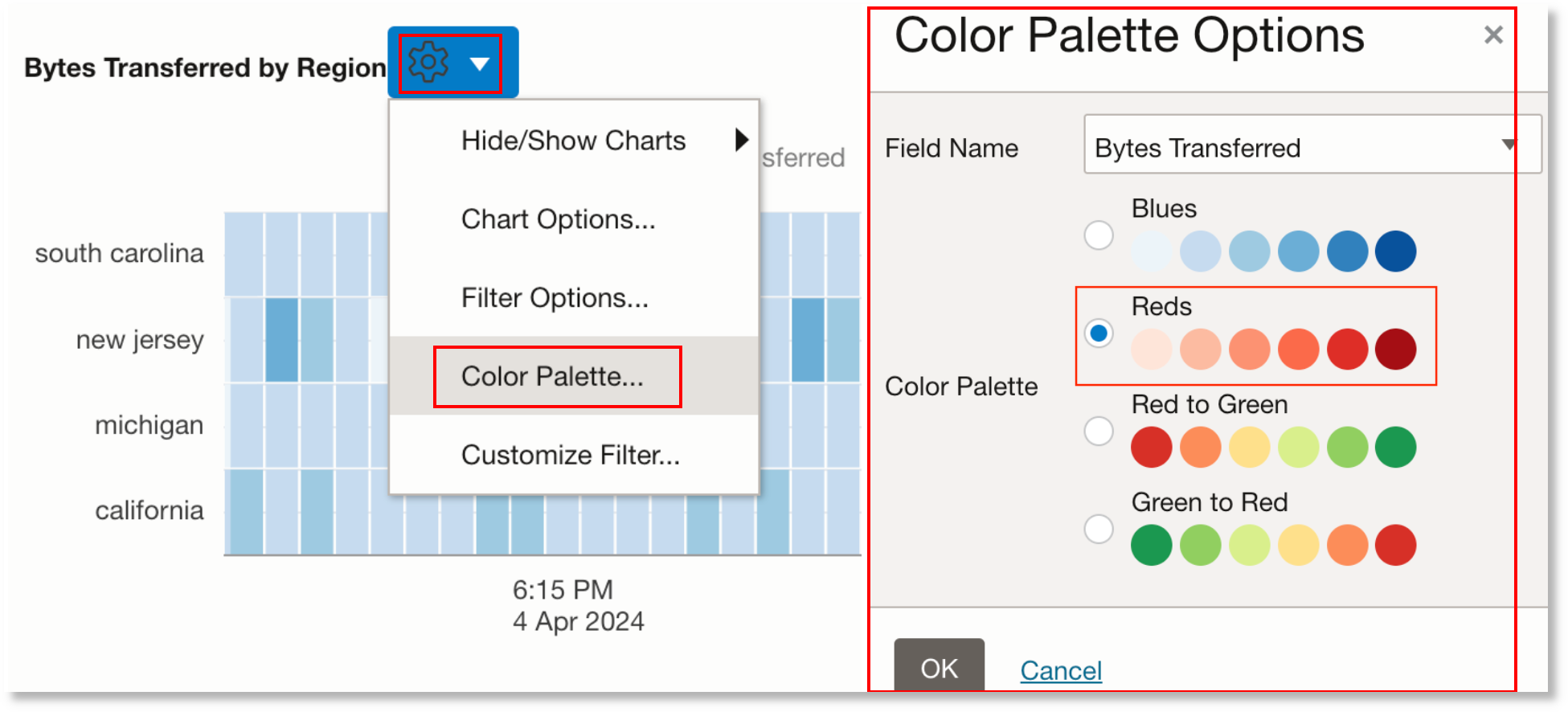
The Heat Map chart changes colors to the palette selected:

In the above diagram, you can notice that the higher values are easy to identify with the higher intensity of colors.
Use and Customize Time Series Filters
Access the Filter Options dialog box from the ![]() Settings menu next to the title of your time series chart.
Settings menu next to the title of your time series chart.
Topics:
Enable Filters
Filter Options dialog box displays the list of fields used in the timestats chart. Enable the check box Show Search Filters. You can select one or more fields to display in the Filter panel. For example, consider the following search:
*
| eval 'Raw Size (bytes)' = unit('Raw Size', byte)
| link Time, 'Entity Type'
| timestats name = 'Entity Types'
            sum(Count) as 'Number of Logs',
            sum('Raw Size (bytes)') as 'Log Size'
        by 'Entity Type'
The Filter Options dialog box would now show the following fields generated by the
timestats command and the fields used in the by clause:
Entity Type, Number of Logs, Log Size.
In the fields panel, you can select one or more filters to view only those specific data points. You can reset the filter by toggling the Select All option.
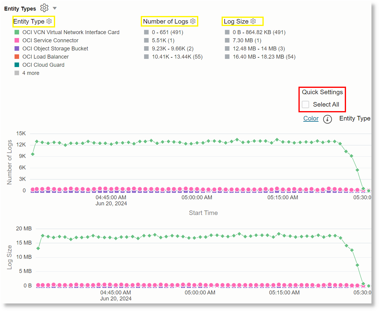
After the filter is enabled for a specific field, to view the complete list of values
for a string field, click the ![]() Settings icon next to the field name.
Settings icon next to the field name.
Customize Filters
Access the Customize Filters dialog box from the ![]() Settings menu next to the title of your time series chart.
Settings menu next to the title of your time series chart.
In case of numeric fields, you can also customize the filter by clicking the
![]() Settings icon next to the numeric field name. The Customize Filter
dialog box opens. The following Range Calculation Method options are
available:
Settings icon next to the numeric field name. The Customize Filter
dialog box opens. The following Range Calculation Method options are
available:
-
Default: By default, the range is fixed to one-fifth of the maximum value and then rounding it to 2s, 3s, 4s, 5s, or 10s. For example, if the maximum value is 48, then the range would be 10. Then the buckets would be calculated as Below 0, Up to 9, 10 - 19, 20 - 29, 30 - 39, 40 - 49, Above 50.
-
Logarithmic: To use logarithmic ranges such as 1 - 10, 10 - 100, and 1000 - 10000, change the range calculation method to logarithmic.
-
Custom: Certain data sets need variable ranges. For example, consider the requirement to bucket CPU Average as 0 - 30% for under utilization, 30 - 80% as effective utilization, 80 - 95% as warning, and anything above 95% is extreme end. To configure variable ranges for this, you can provide comma-separated values
30,80,95. This creates the buckets 0-30, 30-80, 80-95, 95+.
You can optionally enable the check box Bucket Values <= 0 Separately to create a separate bucket for the field values less than or equal to zero.
Search in the Filter
Access the Customize Filters dialog box from the ![]() Settings menu next to the title of your time series chart.
Settings menu next to the title of your time series chart.
For the string fields, you can key in the text for search. You can also
provide regular expressions for searching. For example, searching for
e$ will show all the field values that end with the letter
e.
Check the Invert option to display only those values that don't match the criteria.
Use timestats Command to Plot
a Time Series
The timestats command, when used after the
link command provides additional time series analytics and rich
visualization.
Topics:
In the following example with OCI Integration Activity Stream Logs, the Time Taken Trend is plotted on the basis of the fields Action and Integration:
Duration != null and 'Log Source' = 'OCI Integration Activity Stream Logs'
| eval 'Duration (ms)' = unit(Duration, ms)
| link Identifier, Instance, Action
| stats unique(Integration) as Integration
| timestats name = 'Time Taken Trend' avg('Duration (ms)') as 'Time Taken' by Integration, Action
You can hover on any data point to get the top values for that time period.
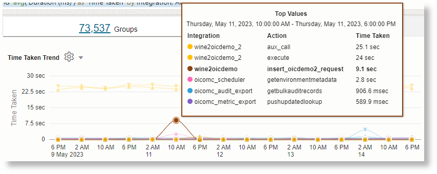
For the details of timestats command and a detailed use case of
plotting time series using the command, see timestats and Time Series Analysis Using timestats Command.
Understanding the Link timestats Syntax
In the detailed time series use case Time Series Analysis Using timestats Command, the following query is used:
'Log Source' = 'OCI VCN Flow Unified Schema Logs'
| link span=1day Time, Action
| timestats name="Trend of Action" sum(Count) as Records by Action
Parts of the timestats command in the above example looks as
below:

The following parameters can be used in the command syntax:
| Parameter | Description |
|---|---|
name |
The optional title for the chart. If this is not provided, then the Y-axis name is used. |
span=<interval> |
An optional interval like 10min or 1hour. The
values are rolled up to this interval using the specified function.
By default, the span specified for the link command is
used. The chart will not align properly if different spans are
specified for the link and
timestats commands.
|
field |
Name of a timestamp field for the X-axis. This field is optional.
The default is Start Time field.
|
<function> |
Name of the function. You can use the functions that are
associated with the stats command with the
timestats command too. For details about the
functions and the examples of using the functions with the command,
see stats.
Use comma to separate multiple functions. For example: Each function will create a new chart. You can use the correlation option in the UI to visually correlate the charts. |
as <alias> |
Provide an optional alias for each time series. |
by <field> |
The function is computed for each distinct value of the specified
field. You can specify more than one field.
All the by-clause values for a given function are plotted on the same chart. There will be multiple charts if you have more than one function in your timestats command. Note: The number of group by fields is limited to 4. |
Using the Fields in the Link timestats
There are two types of fields that can be used for a timestats function:
-
Property field: Any field that is used in the
linkcommand, or created usingstats,eventstats,eval,lookup,nlp, ordeltacommands afterlink. -
Log record field: A field that is defined in the log source, and exists in the log record. You can directly refer to such fields from a timestats function.
Only property fields are allowed in a by-clause. Large fields like Message, Original Content, Error Stack are not allowed in a function or in a by-clause.
Charting a subset of logs: Use the addfields command to generate charts for a specific subset of data. The fields
used in addfields must be a property field. The following example
illustrates the use of addfields:
*
| link Time, 'Log Source'
| addfields
   [ * | where 'Log Source' in ('Linux Audit Logs',
                                'Linux Secure Logs',
                                'Linux Syslog Logs',
                                'Linux Cron Logs')
       | timestats name = 'Linux Logs' sum(Count) as Records by 'Log Source'
   ],    [ * | where 'Log Source' not in ('Linux Audit Logs',
                                          'Linux Secure Logs',
                                          'Linux Syslog Logs',
                                          'Linux Cron Logs')
             | timestats name = 'Non Linux Logs' sum(Count) as Records by 'Log Source'
   ]
Specifying the number of charts to be returned: Use the
topcount or bottomcount parameters to specify
the number of charts to be returned back to the UI.
topcount: When grouping by fields, return N count of distinct groups with the largest aggregated values.bottomcount: When grouping by fields, return N count of distinct groups with the smallest aggregated values.
For example:
*
| link Time, 'Log Source'
| timestats topcount = 3 name = 'Top 3 Log Sources by Count'
            sum(Count) as 'Log Records'
        by 'Log Source'
| addfields
     [ * | where 'Log Source' in ('Linux Audit Logs', 'Linux Secure Logs', 'Linux Syslog Logs', 'Linux Cron Logs')
         | timestats bottomcount = 3 name = 'Bottom 3 Linux Logs'
                     sum(Count) as Records
                   by 'Log Source' ]
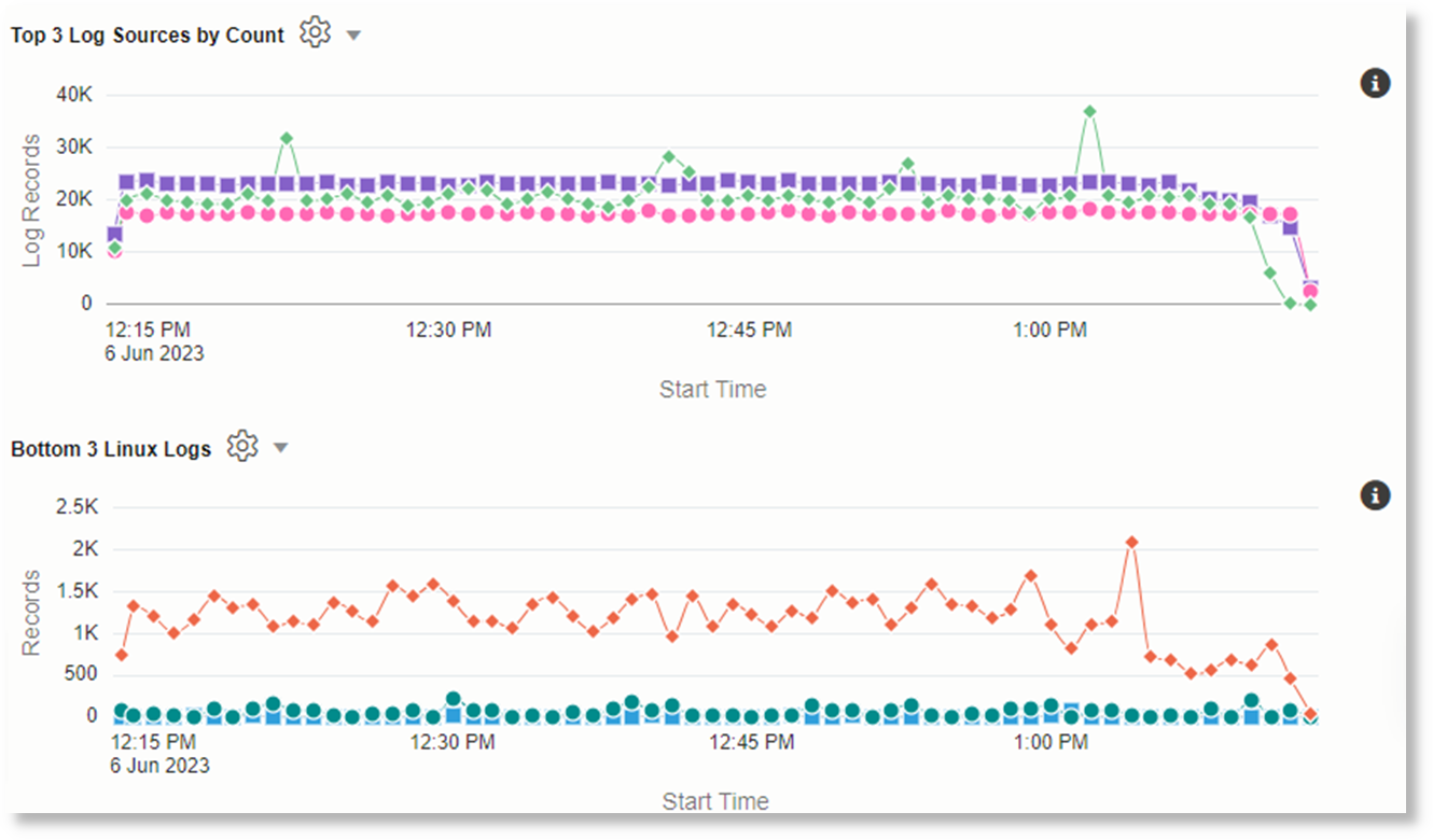
The following charts are generated as the result of running the above query:
Limits for Time Series
-
Number of fields in the by clause: Only up to four fields are allowed in the by-clause.
-
Allowed Fields: Refrain from using large fields in the function and in the by clause. Examples of large fields include the Message field, Supplemental Details, Error Stack and Original Log Content fields.
-
Null Values: Timestats aligns the values in the link table using the values in the Start Time column. For example, a Duration field may have values only for 10:06 AM, 10:10 AM and 1:12pm. As part of the alignment, a timestats avg(Duration) command would average the 10:06 AM and 10:10 AM values into a single average for 10:00am. Since there are no values for 11am and 12pm, they are filled with zeros. The 1:12pm value is placed at the interval 1 PM.
The actual alignment interval depends on the interval used for the query. An interval can be explicitly specified using the span parameter.
-
Number of time series values: Only 100 series per timestats command is returned. Here are some examples that illustrate this limit:
- The command timestats sum(Count) as Records by 'Log Source' returns only the top 100 Log Sources. The top 100 are identified by first sorting the values of each Log Source time series, and then sorting these time series. This means, if Records for a Log Source contains all zeros and a single large spike, then that is included in the returned results.
- The command timestats sum(Count) as Records by 'Log Source', Label returns the top 100 unique combinations of the Log Source and Label.
If partial results are returned, then an info icon next to the time series indicates the total number of series generated.
The following are some of the options to handle large number of time series values:
- Use the
addfieldscommand to filter the specific values to be used in timestats. - Use
topcountorbottomcountto return the top 100 or bottom 100 charts. - Use the
timeclustercommand to cluster the time series. This reduces the number of charts, since only representative samples are returned.
Configuration Options for the Time Series Charts
Similar to the histogram charts, the following options are available for you to
explore using the charts. Click Chart Options icon ![]() :
:
-
Hide / Show Charts: You can hide or show a chart.
-
Selecting the Chart Type: You can select from different chart types.
-
Adjusting the Chart Height and Width: You can increase the height of the chart using the Height option. Drag the Width control to increase or decrease the width of the charts. If there are more than one function, then reducing the width would cause more charts to be displayed in the same row. At full width, all the charts are displayed in individual rows. Reducing the width causes the charts to be arranged in multiple column order.
-
Correlating across Charts: You can use the Chart Option Show Correlated Tooltips to show correlated tool tips across charts.
Additionally, you can also use the following options to configure your charts:
-
Legend Control: You can turn on or turn off the legends using the Show Legend option in Chart Options.
-
Chart Filters: You can use the filters to interactively analyze the time series. Enable the filters by clicking Chart Options, Filters, and Show Search Filters. The filter options show the list of fields used in the timestats chart. You can select one or more fields to be displayed in the Filter panel. After you select the Filter options, the fields generated by the timestats command as well as the fields used in the by clause are displayed above the chart.
Select one or more filters to view only those specific data points. You can reset the filter selection by toggling the Select All option.
-
Search and Customize Filters: Click Options icon
 next to a filter name to view the complete list of values for that
filter. You can enter the text for search. You can also provide regular
expressions for searching. For example, searching for
 e$will show all the results that end in the lettere.Check the Invert option to display only those values that do not match the criteria.
-
Select Colors: You can configure the color for each time series.
Consider the following query that shows the trend of each
Statusin the OCI Audit Logs:Status != null and 'Log Source' = 'OCI Audit Logs' | link Time, Status | timestats sum(Count) as 'Number of Hits' by StatusThe chart displays the Status values and their default color. The values of the Status field are
200,201,404,409,204, and400.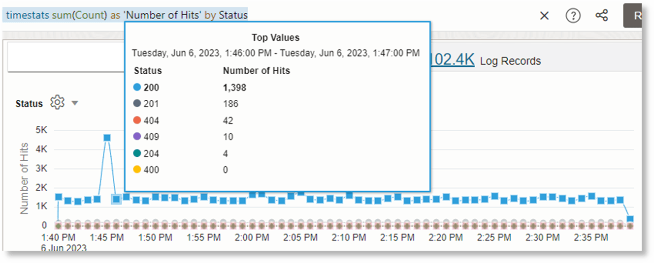
Enable the filters using Chart Options to view the color option next to the chart.
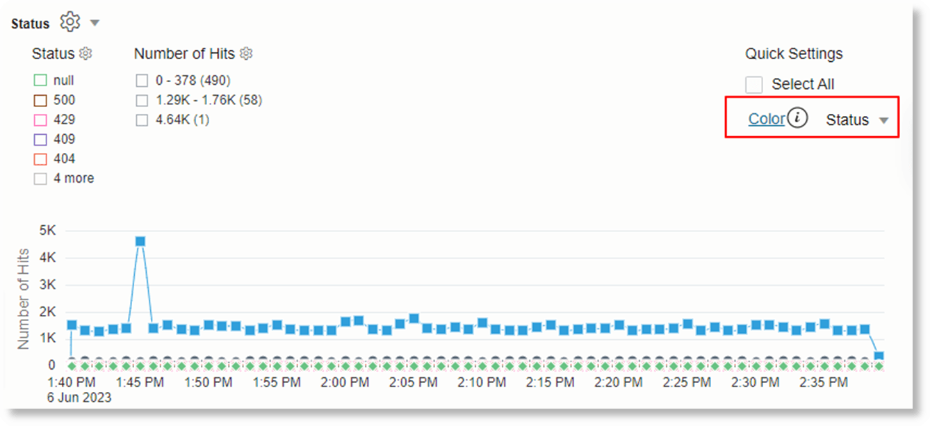
Click the Color link, select
Statusfield, and select a palette that has as many colors as the values to configure.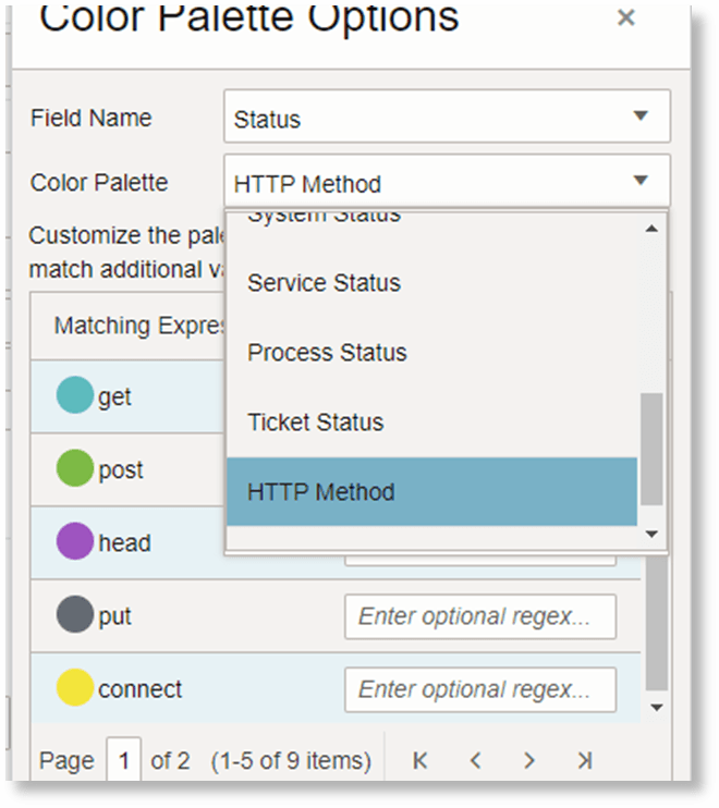
Update each color expression with the value or a regular expression you that want to match.
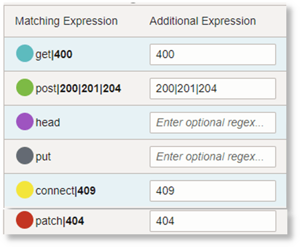
You can repeat this process for each field in the Color drop down to configure the colors.
Use timecluster Command to
Plot a Time Series
You can group similar time series values using the
timecluster command after the link command. Clustering
is useful when there are large number of time series to analyze, or you want to identify
different behaviors in your time series values.
Topics:
In the following example, timecluster is used after link to get representative
samples of OCI Integration Activity Stream Logs. You can hover the mouse on any
data point to get additional details about the cluster:
Duration != null and 'Log Source' = 'OCI Integration Activity Stream Logs'
| eval 'Duration (ms)' = unit(Duration, ms)
| link Identifier, Instance, Action
| stats unique(Integration) as Integration
| timecluster name = 'Similar Integrations' avg('Duration (ms)') as 'Time Taken' by Integration, Action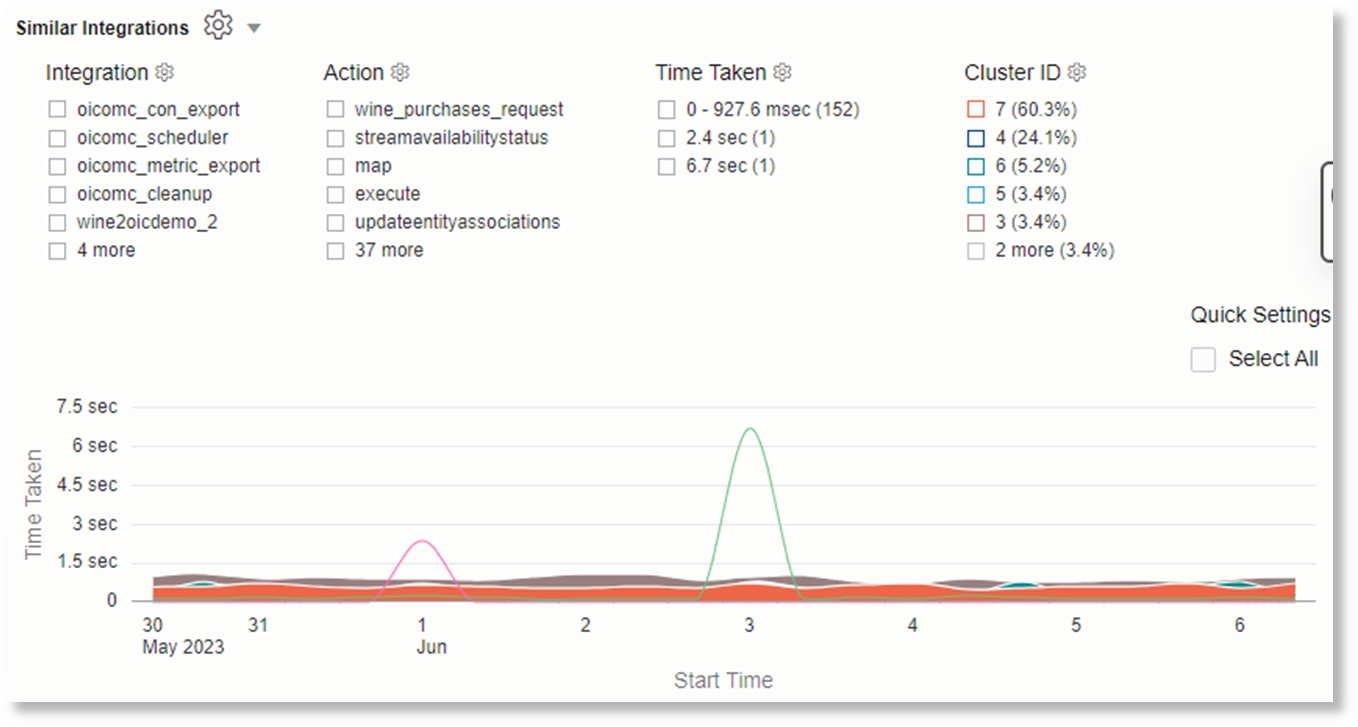
Viewing Individual Clusters using Filters: Click Chart Options and click Filters to enable and view the filters. Select each cluster ID to view the details for that cluster.
Understanding How Link timecluster Works
Clustering looks at each time series that has similar shape and values. Following are some of the characteristics used to cluster the time series:
-
Peaks and Valleys in the time series: Time series with similar peaks and valleys tend to be clustered together.
-
Values at each point: Even if two time series have similar spikes, they can still fall into different clusters, if the values are far apart.
Each cluster gets the following properties that are displayed in the console:
| Property | Description |
|---|---|
| Cluster ID | A unique ID for the cluster |
| Cluster Members | Number of time series in this cluster |
| Minimum Value | Lowest value for this cluster for the selected interval |
| Maximum Value | Highest value for this cluster for the selected interval |
| Value | Value of the specified stats
function for this cluster, for the selected interval
|
| Percentage | Percentage of groups represented by the number members in this cluster |
| Cluster Samples | Few samples of the cluster.
Note: There can be more values than what is displayed in the sample, since these are only samples that show similar behavior. |
timecluster has similar syntax and options as the
timestats command. For understanding the syntax and the
configuration options for the time series charts, see Understanding the Link timestats Syntax and Configuration Options for the Time Series Charts.
For an example use case of plotting a time series using
timecluster, see Time Series Clustering.